Its 21 February at Cape town's own Cape Peninsula University of Technology!
Doing my thing in the design labs...
This week's project is typography posters. NO pictures. NO illustrations. NO frills and flops. Just good old plain letters building up a poster. Working on Adobe in-design, the poster must catch young designer's eyes yet hold information about the particular typeface/ font: I was working with "Goudy Old Style."
Project deadline: 22 february (TOMORROW!) and you can imagine the hype...
Clicking of computer keyboards and "mice", cranking printers... feel my drift?
And that is nowhere near what is actually happening in people's heads!... Shhhhh
Here's a few samplesthat I thought of sharing.
(The paragraph text is basically the same in each design, only changed to suit the heading.)
Legggooooo
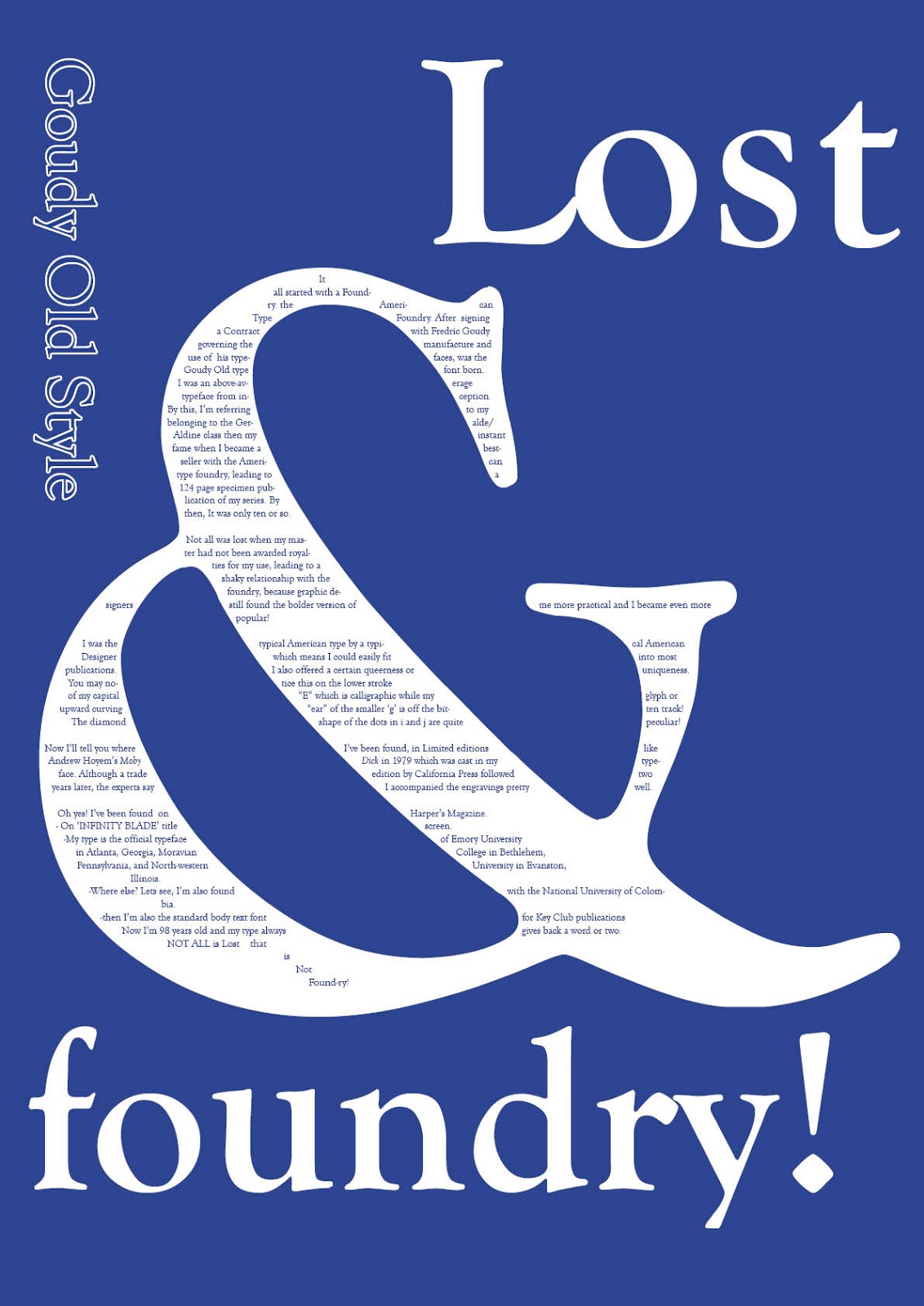
Interview with a typeface
Text Reads:
Q: Where do you come from? And when were you born?
G: I’m a Native American, Straight from the hands of Fredric Goudy. It was in 1915 when the American type Foundry led to my birth after signing a Contract with Fredric Goudy governing the manufacture and use of his typefaces, one of which I was.
Q: Tell us about your early days.
G: Honestly, I was one of those above-average children. By this, I’m referring to my Geralde class then my instant fame when I became a bestseller with the American type foundry that led to a 124 page specimen publication of my series when
I was only ten or so.
Sadly, my master had not been awarded royalties for my use, leading to a shaky relationship with the foundry. However, graphic designers found the bolder version of me more practical and I became even more popular.
Q: Indeed? That leads us to our next question: what contributed to the limelight that you enjoy even up to today?
G: As I told you, I was a typical American design by a typical American which meant I could easily fit into most publications. I also offered a certain queerness or uniqueness. You may notice this on the lower stroke of my capital “E” which is calligraphic while my upward curving “ear” of the smaller ‘g’ is off the bitten track. The diamond shape of the dots in i and j are quite peculiar.
Q: And your journey all the while? Where have you been?
G: For one, a Limited edition of Moby Dick by Andrew
Hoyem in 1979 was cast in my typeface. Although a trade edition by California Press followed two years later, the experts say I accompanied the engravings pretty well.
Q: Where else?
G: Let me see, oh yes, the Harper’s Magazine.
- In ‘INFINITY BLADE’ title screen.
-I was the official typeface of Emory University in Atlanta, Georgia, Moravian College in Bethlehem, Pennsylvania, and North-western University in Evanston, Illinois.
-I was also used by the National University of Colombia.
-then I’m also the standard body text font for Key Club publications
Q: Any other word you want to leave with your fans?
G: That would be all Goudy old friends!
 NOT MY TYPE!
It's simple:
Stick...to....your...TYPE!
NOT MY TYPE!
It's simple:
Stick...to....your...TYPE!
This will be my last for today but I did about 8 samples :/
LOST AND FOUNDRY!
NOT ALL is Lost that is Not Found-ry!
E-mail me Here or add me on Google+ so we can chat about graphic design and all that jazz.
I shoot spammers! Ask Oscar Pistorius!!
NOW DON'T JUST SIT THERE..... APPLAUD!